 Keke Design
© 2023 Keke LE Design
 Keke Design
© 2023 Keke LE Design
2016.5
Article [EN]
Design Philosophy, UI Design
Instagram, “a global community of interests sharing more than 80 million photos and videos every day”, has launched a big iteration on its graphical user interface and brands of product, which is not just to express a simple rainbow gradient, colourless inside pages and a doing-process video, but moreover a design philosophy and values behind that.

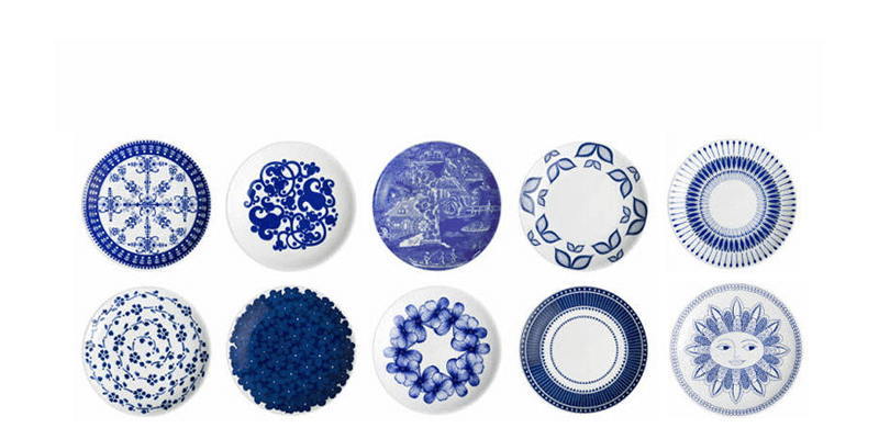
Before exploring what kind is the design philosophy, I would like to give an example for the beginning. When a dish to be evaluated, its colour, smell, flavour, etc. will be the factors as usual. Fragrance is to capture the sense of smell, taste is to capture the sense of taste and then the dish's appearance is to capture the vision. That is, simply, a good dish smells good, looks beautiful and tastes great. To have an impressive look, besides toning dishes, fire control and selecting side-dishes during the period of production, it is important that how the food is presented in the plate. A creative chef can often put highly ornamental even moral dish with the same foods. So we'll usually see in Michelin restaurant, there're mostly the plates with a white background, but different in shape. That is because using white plates can maximise the creation space to chefs and make diners pay the greatest degree of attention on the foods itself. If we look presenting dishes as creative painting, then I think that those Michelin chefs also want a piece of white paper to present their work.
Based on the above Michelin example, we will find that, compared to the fruits in a blue-pattern plate (right), the one in white plate (left) can attract more eye-focus on the fruit itself: Appropriate margin puts fruits on the visual centre and decorative background makes fruits slightly overshadowed.
Plates with a decorative pattern does look artistic and beautiful. To some extent, those nice looking plates are not for supporting foods any more, but rather that it itself is a saturated visual art. So when the foods are put on those plates, they are overwhelmed as a “dwarf”.
So if the users' photographs, videos and stories are the colourful foods, as a product or platform, itself should be relegated to no-stylish as “white and transparent” as possible, even abandons its brand theme blue, being the most humble status to support and embrace the most diverse contents.
This is what I called “half-full or half-empty” design philosophy. A cup full of water can not tolerate more in, where the given inevitability kills inclusiveness. Contrarily, appropriate space left can make more different stories included and happened under different scenarios and roles. Similarly, we can also be understood from the Japanese philosophy of life — “80% fitness of Objects”. That is, designing everything should hold a degree, not to be full. The “Eighty” is an imaginary number referring to a certain and appropriate degree or “volume” of a product, the remaining “Twenty” volume is to be filled by the users. So this remaining part is completely different with the different users under different scenarios. Only when the “Eighty” including the “Twenty” equals the fully “Hundred”, the story is complete and perfect.
For a mainly user-generated content (UGC) dependent product or platform, content is the core and the visual centre. It is the organic and inclusive but competitive relationship between products (object) and user (content), which is not even a mathematical equation (80/20), but more like a chemical reaction: “Ten” appropriate design can not only absorb the contents of “Ninety”, but to enlarge it more.
Also, we can see the original intention from the Instagram official blog: “The simpler design puts more focus on your photos and videos without changing how you navigate the app.”
Firstly, almost all the buttons and icons abandoned the familiar blue (this move is very bold, because the Instagram blue almost represent its brand which leave a great impression to users, just as Airbnb red, Twitter sky blue) and changed into the most neutral colour system (black, grey and white). People always say that black, grey, white are the ones can be easily matched with every other colours. Actually, the reason is that they are essentially playing a white plate role standing behind all colours with hue.
Secondly, because the theme blue disappears, the orange label for pushing notification had been replaced by the most conservative red one. On the one hand, the natural orange-blue contrast colours is ungrouped because of the blue's leaving, then it'll be a kind of “chicken rib — things of little value” if the orange still stays, even a redundant pattern painted on a burly white plate. On the other hand, for staying “white” without losing its basic notification functions, the final selection is the red based on that red as a warning and reminder in phone interface is the lowest-cost type for user identification and learning.
Then there is the colour of the label and words with links has changed, which many people are not aware of. We can have a look, the colour in new version is deeper than that in the old version, closer to dark blue. It would even needs more attention to identify the dark blue among those body and username black. Of course, this is also based on long-term accumulation of Instagram user habits — users have become accustomed to identify the link when seeing the @ or #. So it is feasible that reducing the visual weight of those elements except contents as much as possible.

For user-generated content (UGC) platform or product, designs should focus on how make it easier and convenient to publish, share and manage contents, other than upstage that. It is not only the graphic user interface able to do so, but also the interaction logic: The lowest-cost of learning interaction is designed to relegate to the bottom for reducing the most barriers getting in the using flow — that is no design, such as whatsapp and wechat using iOS native interaction and interface styles, in other words is to leave most spaces, that is the very Eighty fitness of Object.
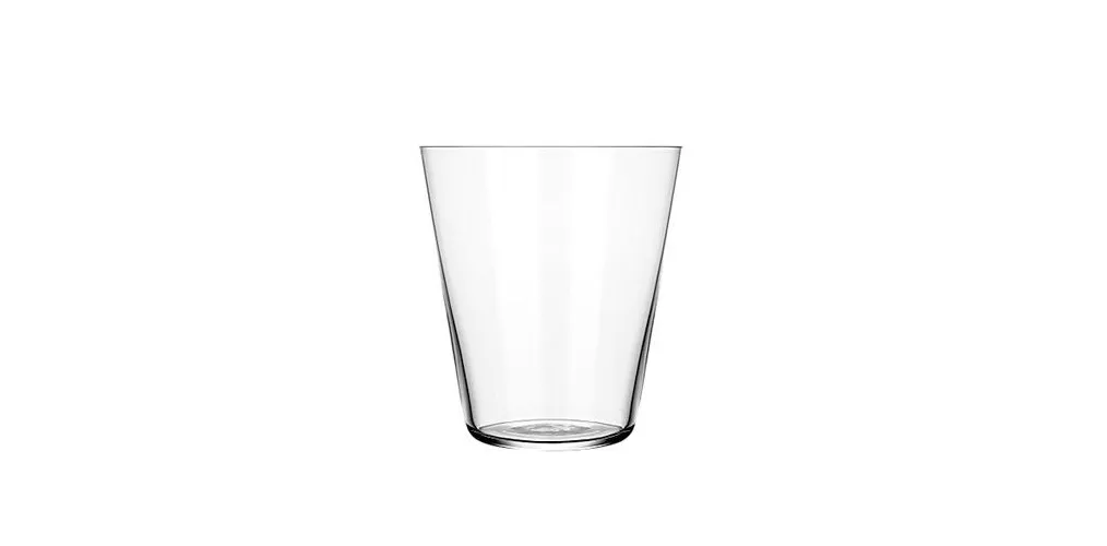
Once a person took a glass of orange juice, asking people, what it was. Others replied: “Orange juice.” The man then took a glass of oil, then asked people, what it was. Answered: “Oil.” So he took a glass of Coke, and asked what it was. Answered: “Coke.” Finally, the man emptied the glass, ask what it was. The answer was: “A glass.”
Although the glass was in this man's hands three times when he asked a ask, not even been noticed even one time. Presumably this is what Instagram want to be.
Keke LE
Keke LE Design © All rights reserved.