 Keke Design
© 2023 Keke LE Design
 Keke Design
© 2023 Keke LE Design
2023.2
Article [EN]
Virtual Reality, Interaction Design Principle
This is a research proposal on Metaverse E-shopping scenarios that I was responsible for during my time at Alibaba design. XR (VR and AR) immersive experience is a key element in the metaverse context. At that time, there were many product cases due to the metaverse mania, among which the most examples were user avatars wandering in the virtual world, with unclear functional tasks, unreasonable interaction design, and confusing visual presentation making them failures. After studying a large number of cases and XR technologies' design specifications, the following basic design principles were produced.
Avoid poor perception to a product value and high user fatigue.
When a product lacks practical functions to solve problems and has a complex experience, users will eventually get lost and leave no matter how fresh their senses are at the beginning. Firstly clarify the problems, needs and use scenarios that can be efficiently solved or worked by XR, maximize the efficiency of using XR to satisfy the needs, control the cost of interaction (reduce the fatigue), and pursue the sense of pleasure at last.
Focus on features and experiences where XR has advantages.
The XR experience is not suitable for scenarios where users need to use it for a long time due to the fatigue of the wearable device. In addition to purely sensory-enhanced scenarios (such as games), there is a need to look for scenarios where the use of XR technology and experience can enhance efficiency and problem solving. Such as try-on, learning and training, etc., can help users simulate events more intuitively in advance and make more accurate decisions.
Make compatibility with multiple device interactions based on performance differences.
Personal computer environment for optimal results + XR headset streaming + Mobile web adaptation → XR headset environment implementation → Mobile environment downgrade implementation. Interaction design based on device (information hierarchy / layout / direct and indirect interaction / UI elements, etc.)
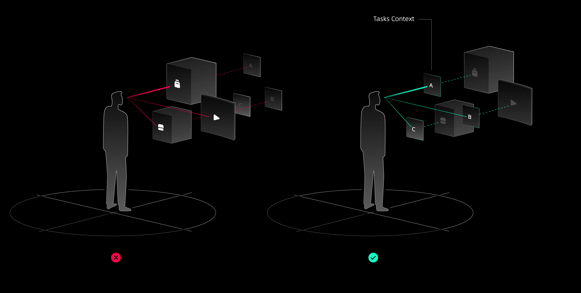
Prioritize experience tasks clearly, reduce multitasking parallelism.
No clear task context can lead to unfocused purpose of user behavior. No primary and secondary relationship between discrete tasks can lead to a lack of perceived value of the product's core functionality. Therefore, when designing an efficiency-oriented XR product experience, it is important to communicate clearly the action tasks at Main/First level of information hierarchy, and to convey the primary and secondary position of multiple tasks by means of classification and subjectivity perception principles.
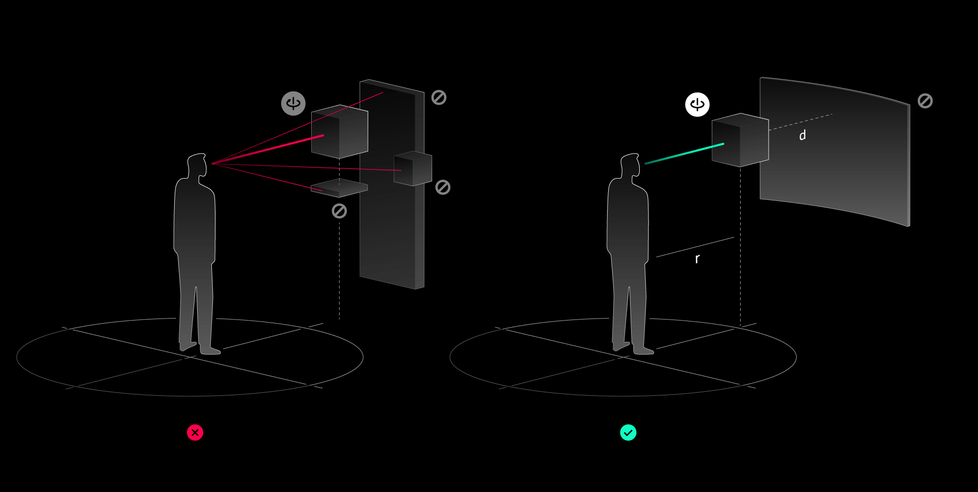
Enhance the subject perception of interactable objects, reduce the interference of spatial atmosphere.
Mixing primary and secondary object elements, rendering all objects equally without distinction in front of the line of sight, and weak expression of interaction guidelines can lead to weak object recognition for primary interactions. Avoid the above problems by means of the layout and proportional relationship between objects and space canvas, functional visibility of objects for interactive operation, and appropriate design of space atmosphere.
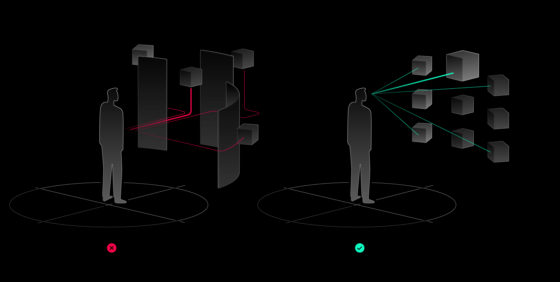
Enhance direct access to interactable objects, reduce inefficient and time-consuming orientation perception and search.
The unpredictable number and orientation of objects, the high cost of object accessibility, and the dilution of interactive tasks by roaming tasks can cause users to spend too much time looking for interaction targets and thus lose their core tasks. Interactable objects need to be clearly perceived by users in terms of their location and distribution, and the directness can be improved by reasonable object-user relationship design.
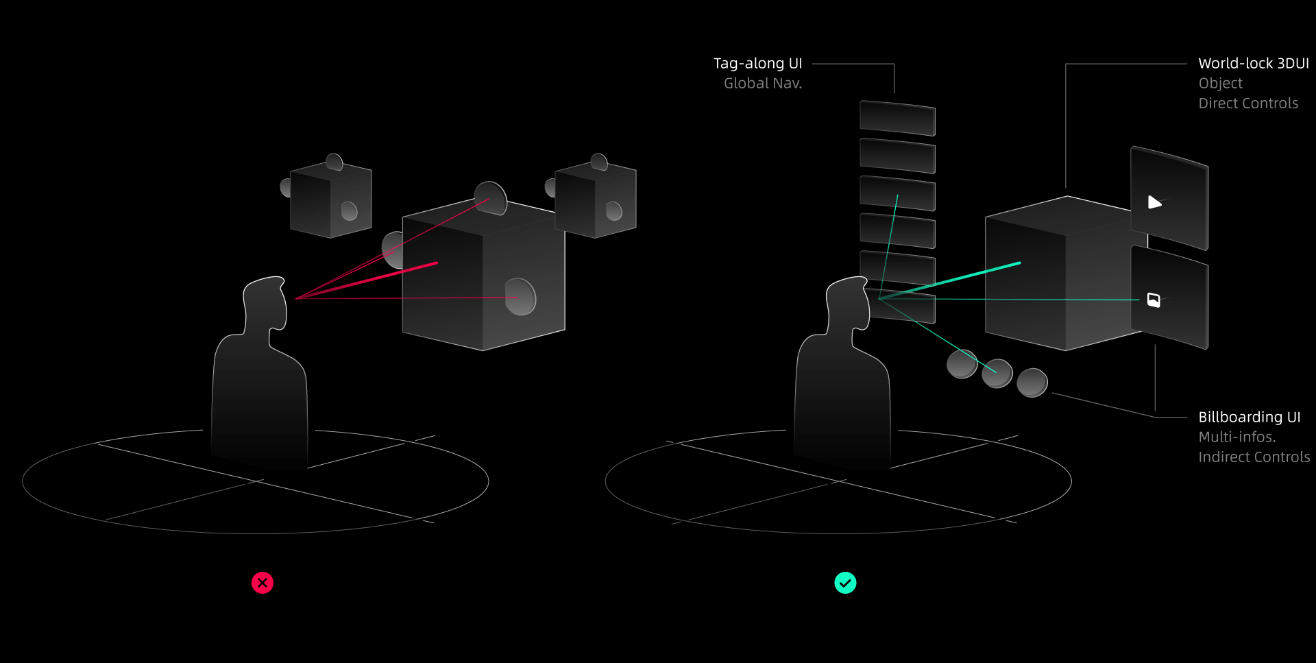
Determine 3D or 2D information interactive display with the judgment of efficiency.
Excessive freedom of 3D interactions, inadequately display of efficient 2D information such videos, images and indirect controls, which will reduce the efficiency of interaction and at the same time lead to a low Return on Investment of model making. UI elements need reasonable design: use world-lock 3D UI elements for directly interactive objects, billboarding 2D UI elements following the subject object for auxiliary information or indirect operations, and Tag-along 2D UI following the user's line of sight for global navigation and information.
Enhance object authenticity, reduce distrust due to inauthenticity.
For those scenarios where users are concerned about object realism, such as online shopping, live chat, simulation games, twin factories, etc., as long as the object or scene is a little bit unrealistic will make users unable to make decisions. The improvement of realism is shown in: object material, light and shadow, physical movement, freedom and fidelity of interactive feedback, user's sense of scene immersion, etc.

Under the XR product form of platform-based, multi-task composite, and Operation System application, the basic interaction information structure can be divided into three levels:
Level 1 for space distribution, global navigation, and single-task space preview.
Level 2 for in-space navigation and content objects into individual task contexts.
Level 3 for subsidiary information and actions of main interaction objects.
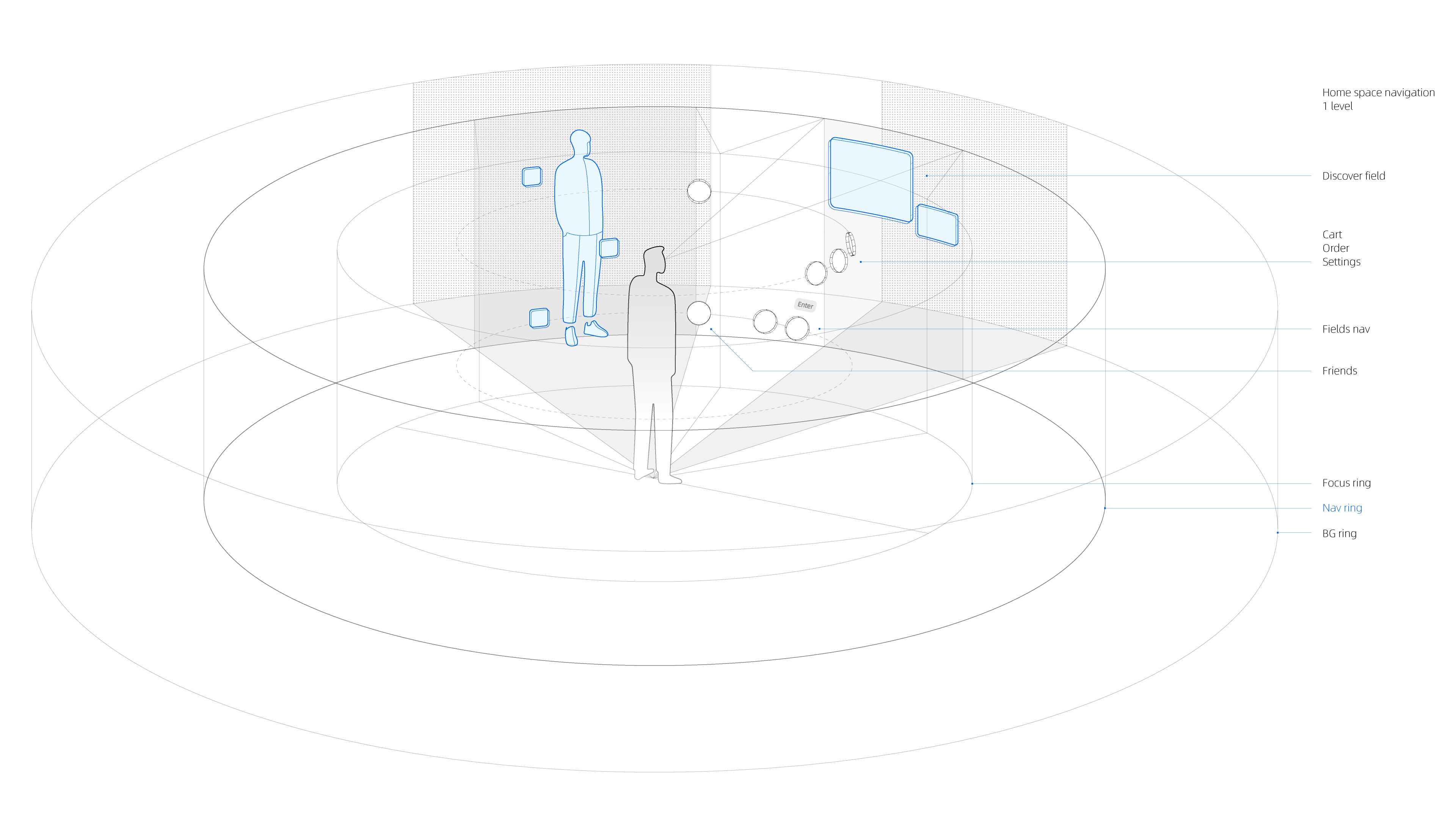
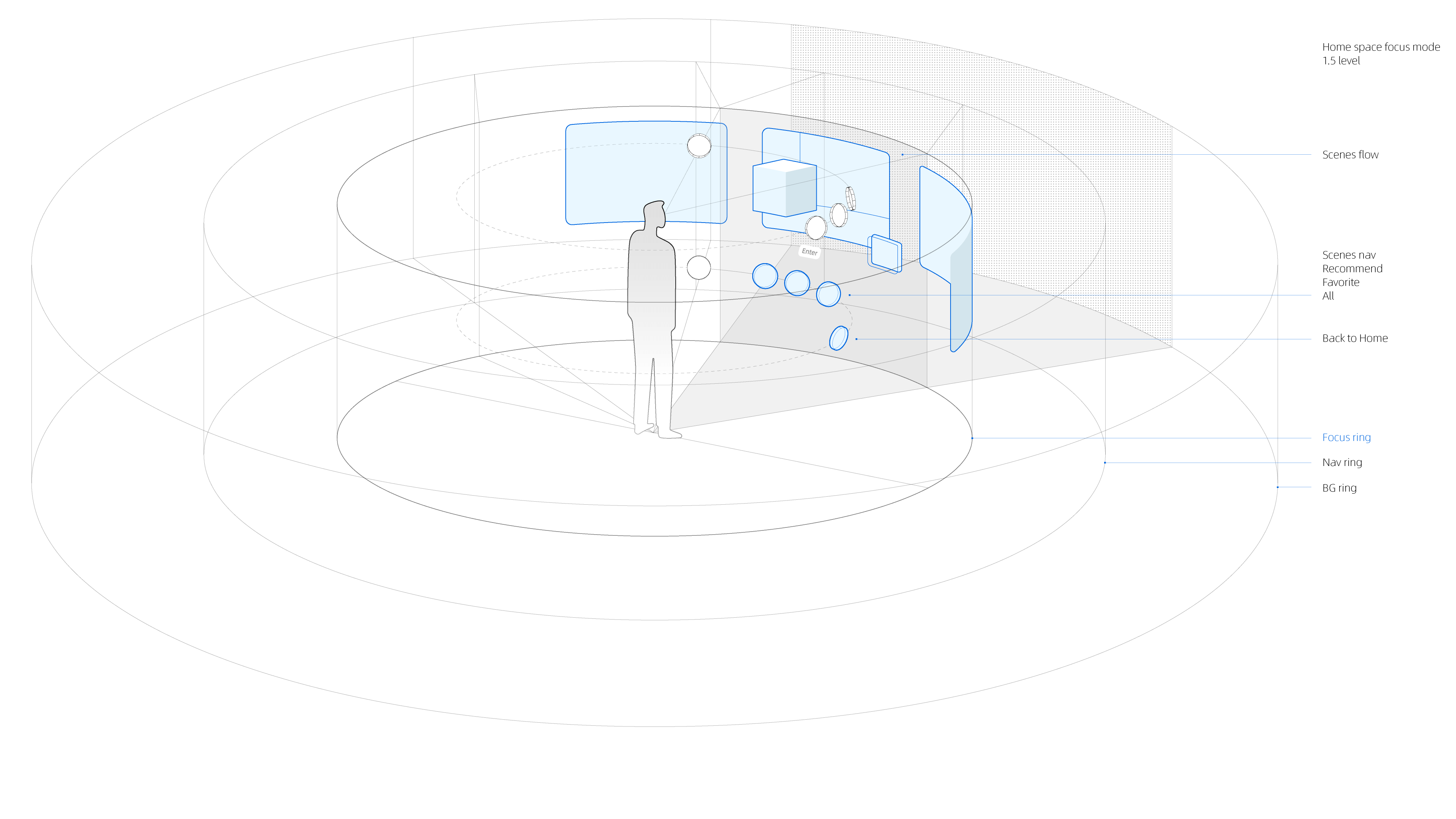
Taking XR-shopping platform-based multitasking product as an example, after determining the function and specific information structure (not shown), the core 3d wireframe is drawn. Home space navigation is in level 1. Focus Ring, Navigation Ring and Background Ring are set according to the object and user distance. For example, the discover content field and virtual wardrobe in home space appear in the nav ring as the distribution entrance, when the user enters any of these task scenes, the content of level 2 will appear in the focus ring, and of course the background ring is always in the farthest layer.
Certain content has been hidden due to disclosure agreement.
Keke LE
Keke LE Design © All rights reserved.